The Google Page Experience Update Guide
What makes for a good page experience? In this post, we discuss the page experience update and provide steps for how to improve page experience signals across your web pages.
In their everlasting quest to provide users with the best results for search queries, Google added Page Experience metrics to their ranking algorithms. The Google Page Experience Update made it so factors such as mobile-friendliness, web safety, interstitials, and a site’s overall UI/UX are officially ranking factors. The Page Experience Update rollout started in early June 2021 and ended on September 2nd. It was the first update to heavily focus on a user’s experience within each part of a web page.
Google’s motivation behind the update was to improve the overall search experience through the websites they promote in Google search. As a result, websites that prioritize creating a high-quality and engaging page experience saw an improvement in their overall rankings. Those that didn’t adapt, well, they dropped in their keyword rankings.
If you’re not sure whether your web pages provide a high-quality page experience for users, this article is made for you. Our guide will walk you through how websites that have maintained their search visibility have responded to the Page Experience Update. Then, you can replicate their strategy in your own website for improved SEO performance.
Where Does the Page Experience Fit Into Google’s Algorithm Updates?
The Page Experience truly shook up the SEO world in 2021. Why? This update added a new layer to how SEO experts prioritize the usability of websites. As a result of the update, Google is not only focused on promoting relevant pages, but those that provide enhanced speed, less element shifting, and improved responsiveness. The value of a web page is not only in its relevance, but in how it performs for the user, and most experts e agree this update is a change for the better.
Other Google Updates
This is not the first update Google has launched to its algorithms. Google has a long and varied history of updating its algorithm. In 2018 alone, Google launched over 3,000 updates to how the browser produces search results. These types of updates range from large to small, and they usually include changes to indexation, data, search UI’s, webmaster tools, and ranking factors.
How Algorithms Affect Internet Searches
All of these updates play into the many algorithms that power every search. Google uses algorithms to help fulfill a specific function, grouped into one larger, core algorithm. Sound complex? We promise it’s not.
All of these updates play into the many algorithms that power every search. Google uses algorithms to help fulfill a specific function, grouped into one larger, core algorithm. Sound complex? We promise it’s not. Here is a breakdown of the different types of ranking factors used by Google:
- Content: The most popular content algorithm is known as Panda, and it helps Google judge relevant content, penalizing and rewarding content based on specific parameters.
- Backlinks: The Penguin update helps Google determine if a link is spammy and deserves to be factored in with the crawling and indexing process.
- Organizing: All this information has to be stored somewhere, and there are specific algorithms to help with that.
- User Experience: In addition to your great content, Google needs to see if your website brings valuable information to users. It does this by rating your website’s user experience (UX) and factoring it into the search engine organic results.
What is UX & Why Does It Matter?
Simply put, user experience is the study of how users interact with your website. User experience targets potential users at all steps of their journey and helps you get into your customer’s minds before they come to your website, during their time on the site, and after they leave.
For many business owners, a good user experience equates to a pretty website. While it is always a good idea to have an aesthetically pleasing website, a few pretty graphics won’t cause your customers to convert. Instead, your website’s interface needs to be optimized with the consumers in mind.
The Impact of Better UX
Here are some user experience statistics that drive home the sheer importance of creating a good page experience:
- 88% of all consumers report that they would be less likely to return to a website after having a poor user experience.
- It’s estimated that businesses with poor user experience lose about 50% of potential sales.
- Consumers form about 75% of their judgment on a company based on their website’s usability and viewport.
- Customers are routinely choosing to browse the Internet from their phones, with 48% of users being annoyed with poorly optimized pages and 53% of users leaving a mobile site if it doesn’t load in three seconds.
- A well-optimized user interface can improve conversions by up to 200%.
When it comes to your website, there are likely hundreds, if not thousands, of competitors offering products and services similar to yours. With this in mind, you can’t risk that your potential customer’s first impression of you is impacted by low-quality UX. Staying on top of user experience trends and best practices has always been important to earning new customers, but it will now be essential to showing up in search results.
What Is the Google 2021 Page Experience Update?
Unlike many of Google’s algorithm updates, Google did release a lot of e information and tools to help users prepare for and respond to this update. The update was a big one and is now considered one of Google’s largest.
Due to trade secrets and proprietary information, Google only released some information about their updated algorithms. But as 2021 unfolded, web developers and SEO experts inferred how to make optimizations to best match the new ranking factors.
Luckily, we’ve done the heavy lifting for you by outlining the key information you need to know to ensure your website provides the kind of page experience that will be most valued by Google.
The New Core Web Vitals
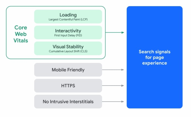
Google released a metric set named Core Web Vitals, a set of metrics that measure a website’s speed/loading time, responsiveness, interactivity, and visual stability. These metrics were released in May, fully functional in June, and remain the foundation of the 2021 algorithm release.
The Core Web Vitals include these three benchmarks: 1. Largest Contentful Paint, 2. First Input Delay, and 3 Cumulative Layout Shift), to help site owners measure a website’s holistic user experience.
While we know that these new measures are subject to change and can still evolve, since June of 2021, they have remained consistent. Here’s the breakdown of the three basic metrics:

Largest Contentful Paint (LCP)
(measures site speed and loading time)
Largest Contentful Paint reports the render time of the largest image or block of text visible within a web page’s viewport. Simply put, it relates to the time it takes for your webpage to load the biggest piece of content on a page. An ideal LCP would be within 2.5 seconds of loading the page.
First Input Delay (FID)
(measures interactivity)
First input delay measures a consumer’s first impression of your website’s interactivity and responsiveness. It does so by monitoring how long it takes from when a user first interacts with a web page (i.e., clicking on a button) to how long it takes for the browser to respond to that action. Think of it as how long it takes for a user to press a button and for that information to appear. An ideal FID is under 100 milliseconds.
Cumulative Layout Shift (CLS)
(measures visual stability)
Have you ever been scrolling on a website and are just about to click on a button, when the layout moves and you are all of a sudden in a different portion of the page? That is a layout shift, and if your website has a lot of them, it can hamper your user experience. Cumulative layout shift measures the combined effect of this movement on one webpage.
Visual stability is exactly that—how stable the webpage is when it loads—and if the page stays steady throughout a consumer’s scroll. CLS measures how many times a user experiences unexpected layout shifts, with the ideal metric for this being less than 0.1.
As a best practice, to ensure that you are meeting the right target for each of these metrics, it is recommended you test and monitor about 75% of all pages on your website. It is important to understand that these Core Web Vital metrics are user-centered new metrics that give real-world data to see and understand how users interact with your website.
What We Know So Far – Page Experience Signals
A better page experience leads to deeper engagement and allows consumers to get more done. There are already existing page experience metrics that Google uses to help webmasters monitor their performance, including:
Mobile Friendliness: Not all searches are created equal, meaning your website should perform on mobile phones at the same level it does on desktops. This new signal will factor more heavily into SEO.
Safe Browsing: This metric ensures the security and safety of your website, verifying there is not any harmful content on it.
HTTPS Security: Having an HTTPS tag on your website means it is safe and secure for users, and their information isn’t at risk of being stolen.
Intrusive Interstitial Guidelines: Many websites have a ton of intrusive pop-ups that get in the way of a user finding the information they need. Because of this, Google has created a set of guidelines on how to include pop-ups on a webpage without severely hampering the user’s experience as a whole.
How to Optimize for Google’s Page Experience Update
All this information on search engine functionality and algorithms may sound complicated, but don’t worry. There are many easy steps anyone can take to prepare their website for the most important aspects of The Page Experience.
Here are a few of the steps you can take to maintain and improve your SEO.
1. Know and Use the Tools Available to You
There are plenty of free tools available to you that will allow you to monitor these new ranking factors on your website. Using them to consistently monitor your own website will not only help your user experience metrics soar but bring more potential customers to convert. A few examples include:
-
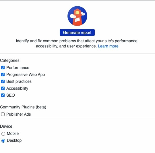
LightHouse: This tool targets the Core Web Vital metrics for each page on your website. In many ways, Lighthouse has become the best way to account for a Core Web Vitals report.
-
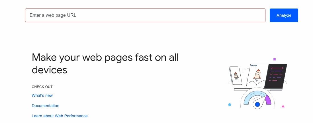
PageSpeed Insights: Here you can check multiple metrics and reports that go into your entire website’s page speed rating and the Core Web Vitals.
-
Mobile-Friendly Test: Check here if your website performs as well on mobile as it does on desktop.
-
Chrome User Experience Report: This report collects real-time data for each Core Web Vital, as listed above.
-
Google Search Console: This gives you a glimpse into what is happening within your website, based on real-world usage from actual consumers for accurate and nearly live reports.
-
Web Vitals JavaScript: This tool measures all Core Web Vitals in JavaScript using APIs.
2. Audit Your Site Across Users’ Devices
If you have both a smartphone and computer, then you likely know the way in which different devices load pages differently, both in terms of visuals and page speed. There are some tools that can help you audit your website without having to purchase a truckload of devices.
- The Lighthouse tool has an easy selection button at the bottom that allows you to switch between running your report for mobile and desktop. And you can use these metrics’ visual indicators and reports for targeting individual components of your page experience to improve.
- PageSpeed Insights also allows you to toggle between your mobile and desktop performance stats.
- With Responsinator, you can test out how your website looks on a plethora of mobile devices, from phones to tablets. This is a great, free way to ensure that the actual rendering of your page is not lost in translation between different devices.
- CrossBrowserTesting allows you to test out both the appearance and performance of your website on over 2,000 different browsers and devices. This is a great way to ensure that your site not only looks but also performs optimally across a range of formats.
3. Improve Your PageSpeed Insights Score
Google’s PageSpeed Insights (PSI) tool lets you know how well your website performs for both desktop and mobile browsers. It also provides detailed information that can be used to deliver a faster user experience. If you find that your PSI is scoring less than ideal (anywhere below a 90), then you’ll want to take some measures to boost your page speed. Here are some ideas to consider:
- Compress Your Images: Large image files are a significant contributor to longer load times. Luckily, there are many free tools available that can help you compress your files and diminish the time it takes to load them. If you host your page on WordPress, then Smush is a handy plugin to optimize and compress images, one you don’t need to be an SEO expert to understand.
- Use a Browser Cache: Browser caching is another simple fix that significantly improves the speed of your page. Essentially, a browser cache allows a web browser to remember commonly occurring elements of your site, such as header and footer material. This way, users won’t have to reload this material every time they click on a new page on your site. For WordPress users, W3 Total Cache is a tool we’ve found useful.
- Implement Accelerated Mobile Pages (AMP): Originally used for news sites, AMP pages are essentially stripped-down versions of existing pages that can load up more quickly on mobile devices. While not necessary for pages loading optimally, AMP can be a boon to pages that are currently lagging. It’s likely you’ve already encountered AMP on your phone, noted by the little, encircled lightning bolt in the page’s corner.

4. Have a Benchmark
It is of the utmost importance to understand where your website stands before you make changes. We all know that having the top spot in the search engine result pages is our top goal, but, if anything, the rollout of this new algorithm means that it is time to shift focus to include a user’s experience.
So you need to test, test, and test! Use the free tools above on each page of your site and move slowly. Take note of what is working and what isn’t in order to be best prepared. This way, whenever you make changes, you’ll be able to track your results easily and won’t be sidelined with the introduction of Google’s search algorithm next year.
5. Optimize Your Content
Your website is nothing if not a place for your potential customers to gain information, so be sure to optimize your content, one of the most important Google search ranking factors.
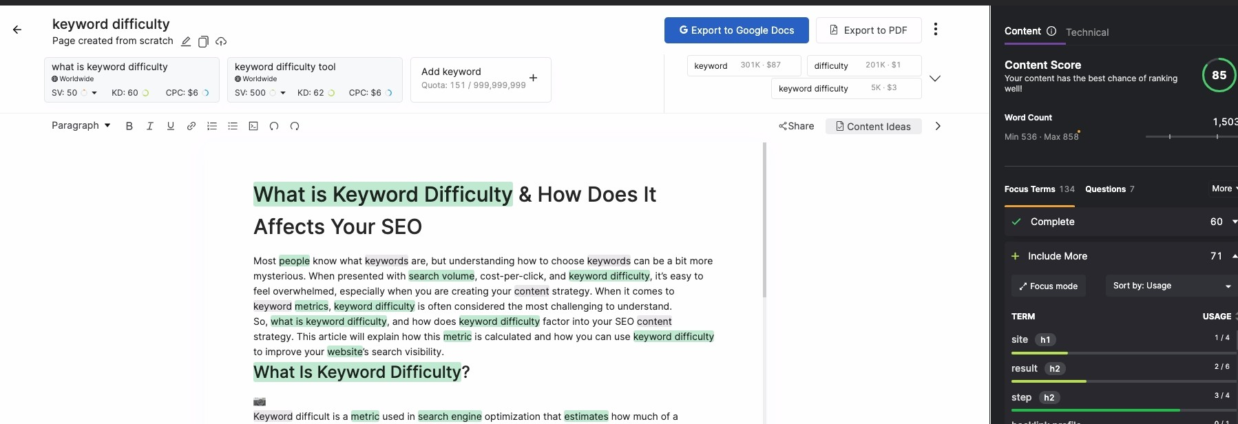
Search Atlas’s SEO Content Assistant is the best way to improve your on-page content (you can access it by setting up a free account). Using this tool, you can target up to five keywords and take immediate steps to give your content more topical-depth and authority.
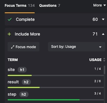
But you can’t just put the content on your page without any organization, as this is where header tags come in. The proper use of headers such as the title tags and header tags will not only segment out your information into easily digestible chunks, it will also make it easier for Google to crawl and index. The SEO Content Assistant will let you know which focus terms should appear in headings.
These subheadings do double duty. They’re also are a great way to optimize your target keywords, as the more prominent they are on your page and your URL, the more Google will believe the information you are creating is valuable content.
6. Don’t Forget Images
Yes, it is important to have original written content on your website. However, it is much more important to diversify the types of content you use. Images are a significant ranking factor, in addition to how they engage the searcher and create a great page experience. Plus, you cannot appear in a Google search for images if you do not have optimized images.
The easiest way to use images is to put them at the top of the page, grabbing the user’s attention as soon as they get on a specific landing page. However, keep in mind the Largest Contentful Paint metric. And make sure to optimize these images by reducing their load time by compressing them. You also want to incorporate relevant keywords in the alt text if it’s appropriate, so in case of a problem with loading the page or visually impaired users are visiting your site, they can see what the photos are meant to be used for.

Get Started and Stay Informed
What did we learn from this rollout? Details and Milliseconds matter… and updating your website in response to Google’s Page Experience update is a win/win for you and your web visitors. They receive a better user experience, and your website is rewarded with positive signals to Google’s web crawlers.
Site owners who focus their efforts on following proper user experience best practices have sailed through the update without major negative impacts to their overall search visibility.
So, get started with amping up your website’s mobile friendliness, responsiveness, and other fixes for a great page experience.
It’s essential to closely monitor your website, even long after new metric rollouts. Be sure to keep tabs on ranking changes. It can take weeks (and sometimes months) for Google to register changes to a page and change your ranking for a Google Search, so you’ll want to check up on your GSC Insights reports.


